
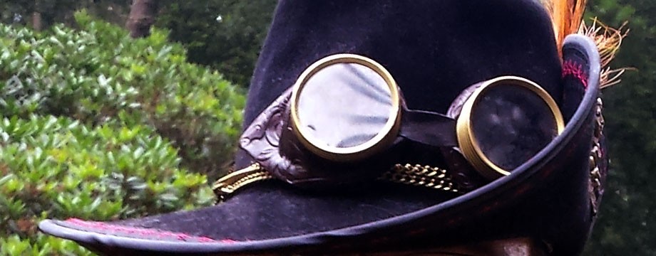
On a bunch of my contraptions I put down a mark indicating in the image itself it was a Circadian Contraption. But each mark was different, and for a project as large as this, I figured it deserves a logo of its own.
What is a logo to me?
- A logo distinguishable. One look at the logo should tell you where it’s from, it should not look overly much like other logo’s.
- A logo has meaning. The design of the logo should refer back to what the logo stands for.
- A logo is scalable. It should look good both large and small.
- A logo should be simple. Overly complex drawings will just substract from the strength of the brand.
So what does all this mean for my logo?
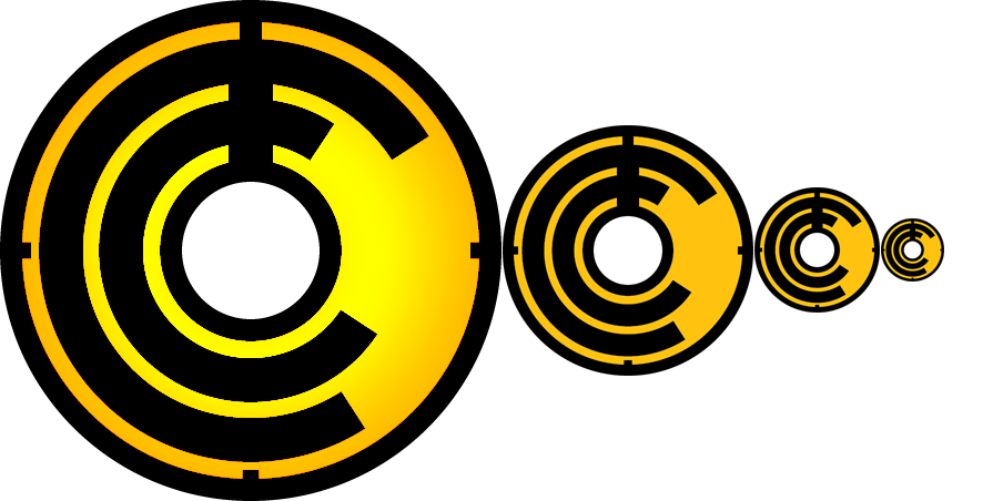
Lets start with the meaning. Obviously the 2 C’s stand for Circadian Contraptions. A contraption is often badly made, so the C’s don’t quite line up but are tilted in different directions, and with that we represent the Contraptions part of the “brand”. Circadian means every 24 hours. What better way to represent this by a clock set to midnight. The broad line up is the hourhand, the thinner line continuing to the top the minutes. To strengthen the clock image, I’ve added markers at 15, 30 and 45 minutes. Finally the color is a reference to yours truly. at cmyk values of 0,25,100,0 it’s the textbook color for Amber.
As you can see it scales pretty well. The minute markers become less distinguished as it becomes smaller, but they are still visible, and the overal image of the logo remains strong.
At first I wanted the color to swap to orange where the C’s and the hands of the clock overlapped, making the overlapping space the background color. In the end this just made the image seem too messy and too complex. By reverting back I kept the logo simple enough for my tastes.
And finally, is it distinguishable? I did a google search for my logo and the best guess google came up with was a vespa logo. I’m sure there are better matches to my logo but that’s good enough for me right now.
Some final thoughts: The logo became pretty versatile. The logo is basically 2 tone, which means that it can be engraved on items or made into a 3d object without loosing detail. The large version here i added a gradient for the background to make it visually stand out a bit more, but i kept with the amber color for the basis. It can be played with and altered in a lot of ways without loosing any of the meaning behind the logo (except perhaps the color, when printing in black and white for example).