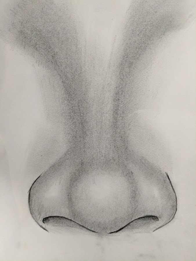
I’ll stick with the face a bit longer, this time I’ve tried my hand at drawing a nose. I’m pretty pleased with most of it, the bridge could use a bit of work, but the “bulbous” part of the nose turned out rather as intended.

|
You are using an insecure version of your web browser. Please update your browser!
Using an outdated browser makes your computer unsafe. For a safer, faster, more enjoyable user experience, please update your browser today or try a newer browser.
|
|
A home for voided heroes |
I’ll stick with the face a bit longer, this time I’ve tried my hand at drawing a nose. I’m pretty pleased with most of it, the bridge could use a bit of work, but the “bulbous” part of the nose turned out rather as intended.
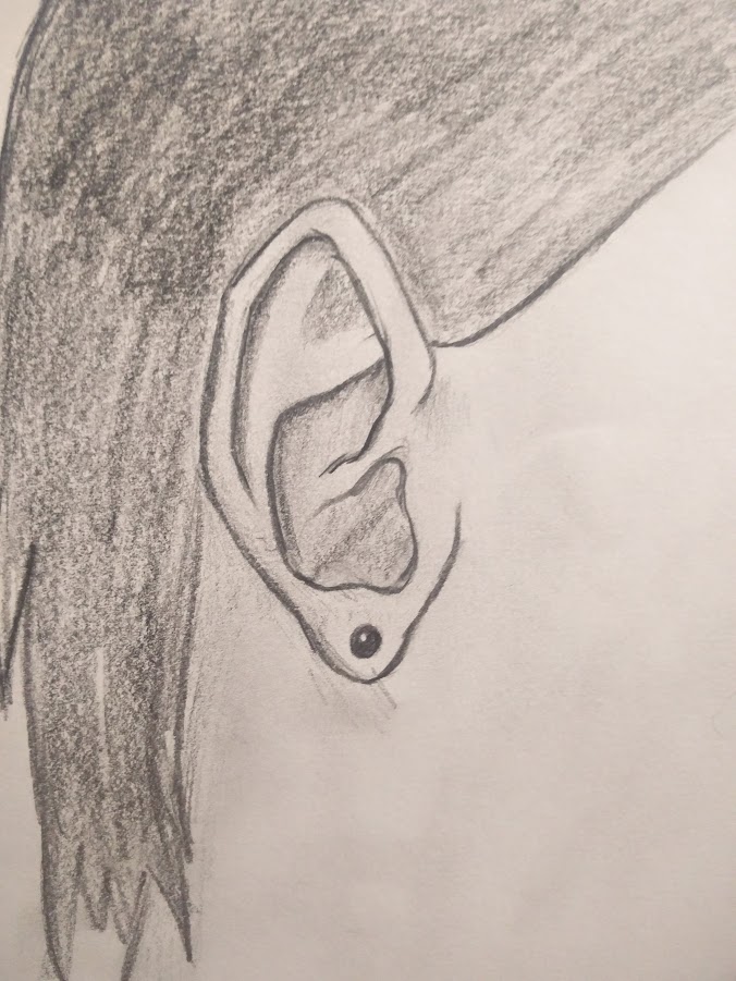
Faces, if you want to draw them property can be quite a hassle. Not only the eyes, but a realistic nose, mouth and ears are pretty hard as well. The hardest due to the weird shape i think is the ears, so that was my focus for today. I’m going to need to draw a few more to be able to draw them consistently well, but for now this is a nice start I think.
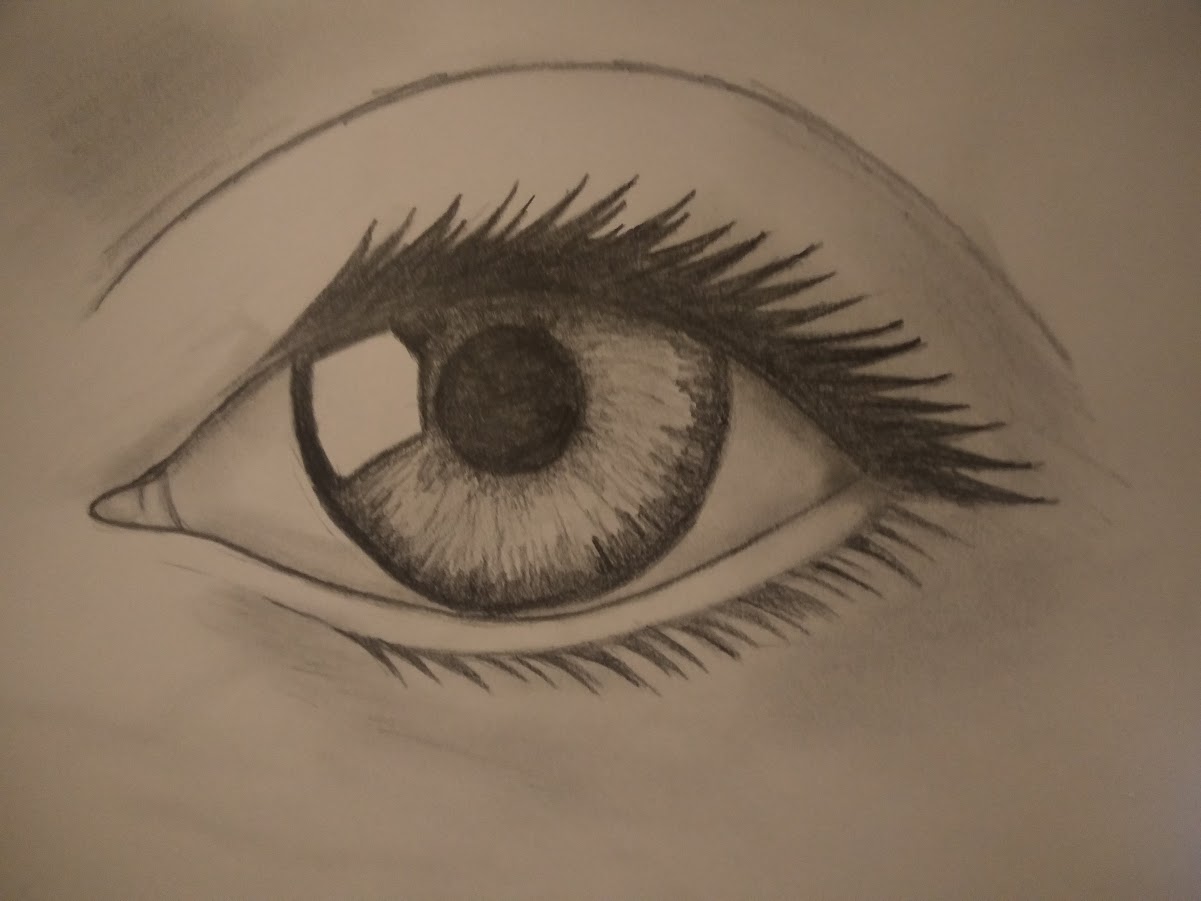
A little while back I drew an eye. I did so from the top of my head, no example, just what i thought I’d remember about the eye. It came out, well, not quite what I desired (see day 42) and I promised to try it again, this time with a bit of help from a tutorial and an example.
Today’s the day I make good on this promise, and I think the help shows. I’m pretty happy with how this turned out.
Tripple word score for today. I’ve been trying to make the Kingspray letters I make more “graffiti” and I’ve tried to do so in a couple of ways. None of them really are what i was looking for, but they were good practice I guess, so here’s three pixels for the last day of the year.
![]()
![]()
![]()
Whilst trying to design a more graffiti like logo, I once again made a too rigid design. A pity, but it’s not useless, I’ve drawn it up in Illustrator and finished up the shadow effects in Photoshop. All three stages included.
![]()
![]()
![]()
My efforts today were cut a bit short and in theme are probably a little bit late, but I was in a silly mood and just went with it. The program used today was Tilt Brush. I probably went a bit overboard with the glitter and light effects, but as its Christmas themed I’ll allow it this time. The sessions was cut short because the controller was out of battery, so the bowl is unfortunatly cookieless

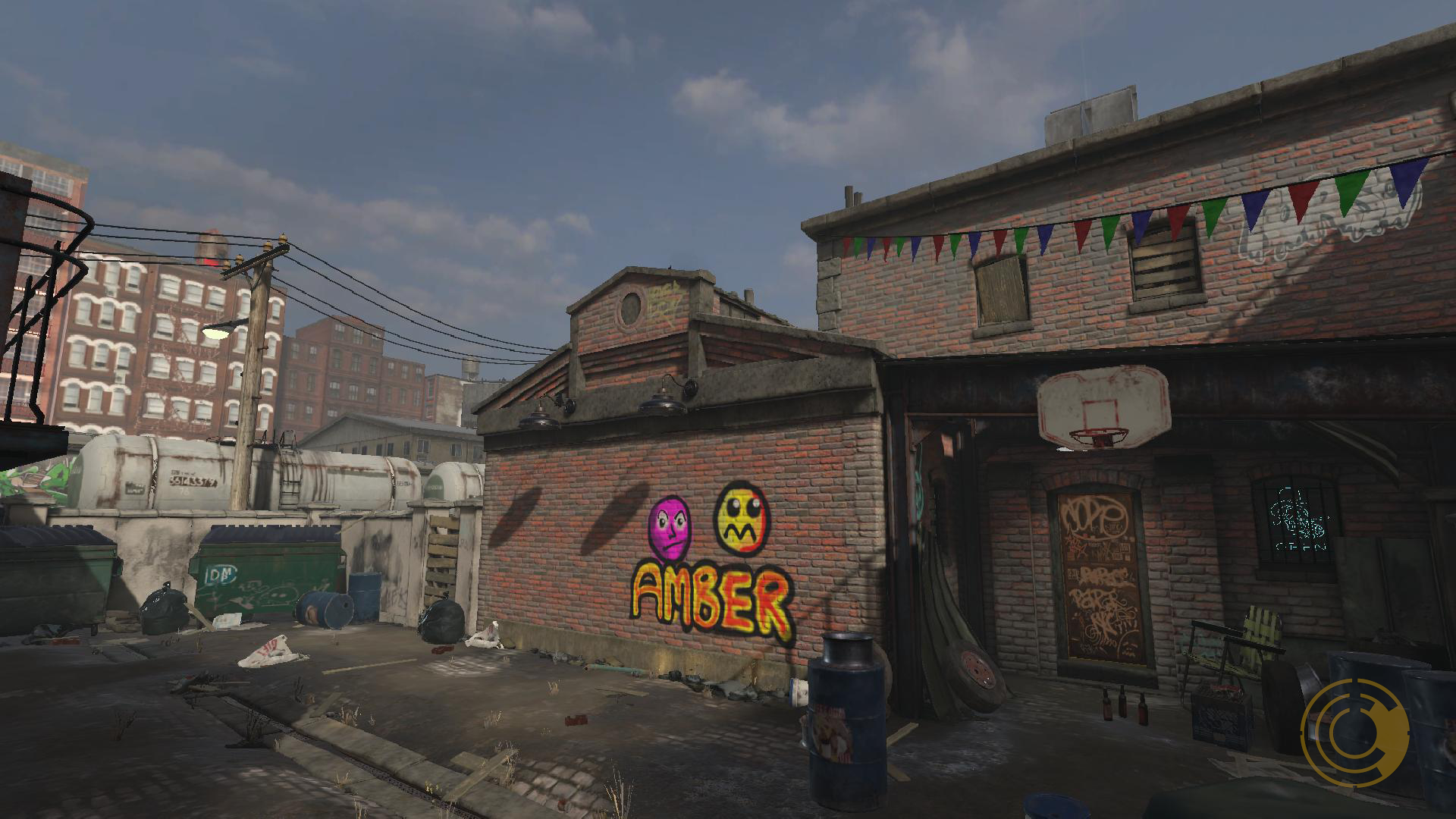
I had this idea of putting some nice text upon a starry background. There was a somewhat decent horizon with a pyramid at one point (video is uploading, you can check it yourself if you’re curious). It ended up becoming the name of the daughter of a dear friend of mine, Rachele Morizzo. The starry background is almost gone, the horizon became more of a lint underneath, and the bloodthirsty baby took away the last space feel.. The stars still worked though.
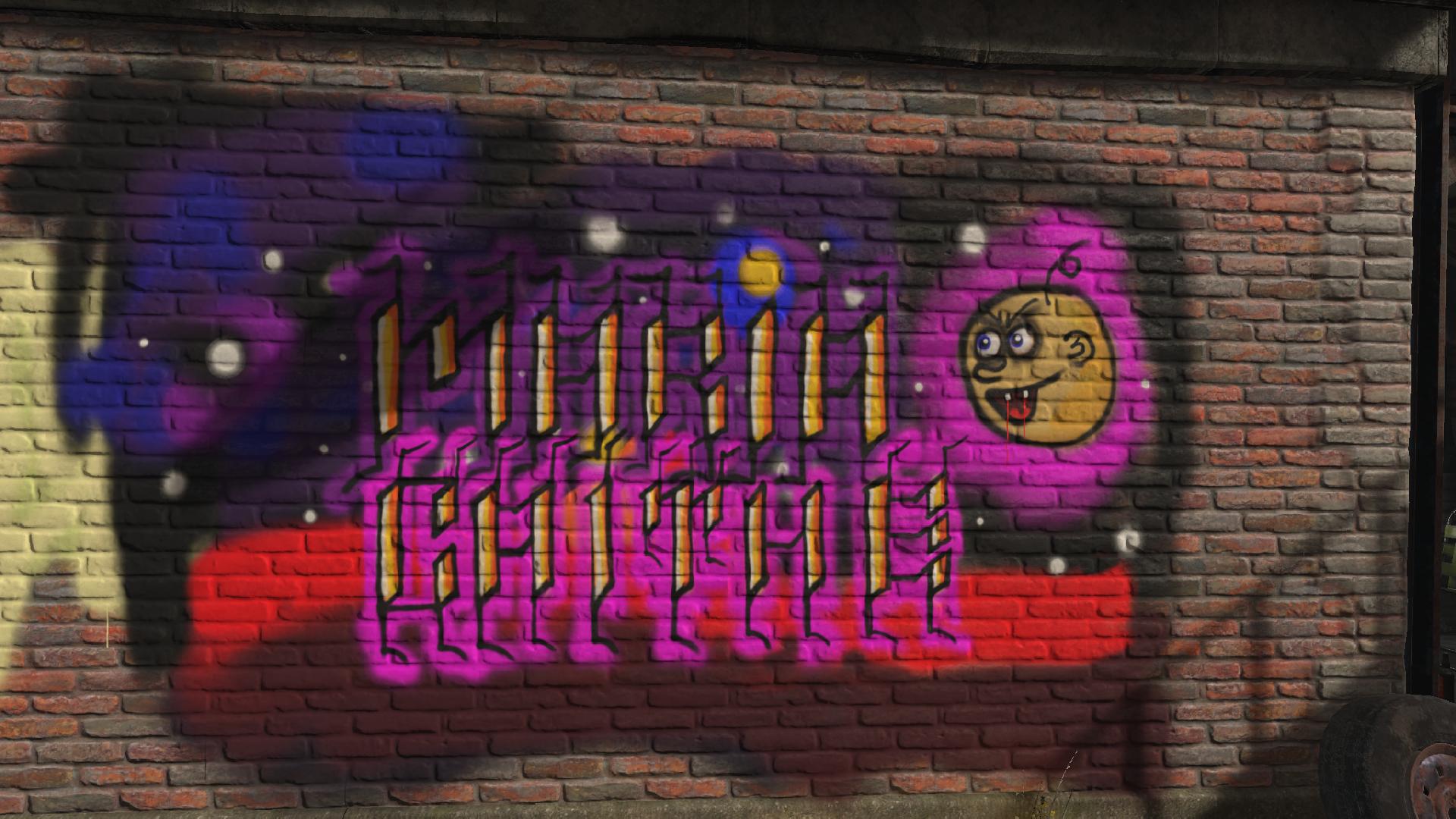
Another day, another graffiti. After spending quite a bit on a single letter A and accidentally closing without saving, I started over and used one of my online monickers (Pixel) to design the new version. (ps, posted a day late, cause i forgot to press publish, Day 49 will follow in a couple of hours)
![]()
![]()
![]()
On the first day of Christmas my sweetheart gave to me…one Kingspray Graffiti game/art program. This game lets you simulate actually airbrushing your own graffiti. Now I have a lot to learn in this program, and in this style of art. Also i need to start watching some tutorials and such, but here’s what i spent my time today with (and this is the part where contraption’s meaning badly put together comes from 😛 )
On a bunch of my contraptions I put down a mark indicating in the image itself it was a Circadian Contraption. But each mark was different, and for a project as large as this, I figured it deserves a logo of its own.
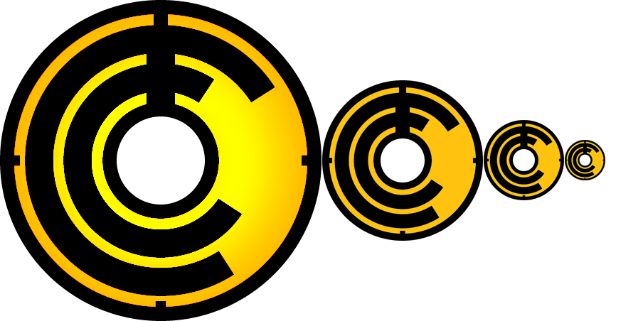
What is a logo to me?
So what does all this mean for my logo?
Lets start with the meaning. Obviously the 2 C’s stand for Circadian Contraptions. A contraption is often badly made, so the C’s don’t quite line up but are tilted in different directions, and with that we represent the Contraptions part of the “brand”. Circadian means every 24 hours. What better way to represent this by a clock set to midnight. The broad line up is the hourhand, the thinner line continuing to the top the minutes. To strengthen the clock image, I’ve added markers at 15, 30 and 45 minutes. Finally the color is a reference to yours truly. at cmyk values of 0,25,100,0 it’s the textbook color for Amber.
As you can see it scales pretty well. The minute markers become less distinguished as it becomes smaller, but they are still visible, and the overal image of the logo remains strong.
At first I wanted the color to swap to orange where the C’s and the hands of the clock overlapped, making the overlapping space the background color. In the end this just made the image seem too messy and too complex. By reverting back I kept the logo simple enough for my tastes.
And finally, is it distinguishable? I did a google search for my logo and the best guess google came up with was a vespa logo. I’m sure there are better matches to my logo but that’s good enough for me right now.
Some final thoughts: The logo became pretty versatile. The logo is basically 2 tone, which means that it can be engraved on items or made into a 3d object without loosing detail. The large version here i added a gradient for the background to make it visually stand out a bit more, but i kept with the amber color for the basis. It can be played with and altered in a lot of ways without loosing any of the meaning behind the logo (except perhaps the color, when printing in black and white for example).